Mastering Dark Mode Design in 2024 for Enhanced User Experience and Engagement
Introduction:
In today’s constantly evolving digital world, user experience plays a critical role in determining a website’s success. One design trend that has gained traction in recent years, enhancing user experience and boosting engagement, is the implementation of dark mode. In this article, we will delve into the concept of dark mode, discuss its user experience benefits, and provide essential guidance on how to create visually appealing and user-friendly dark mode interfaces in 2024.
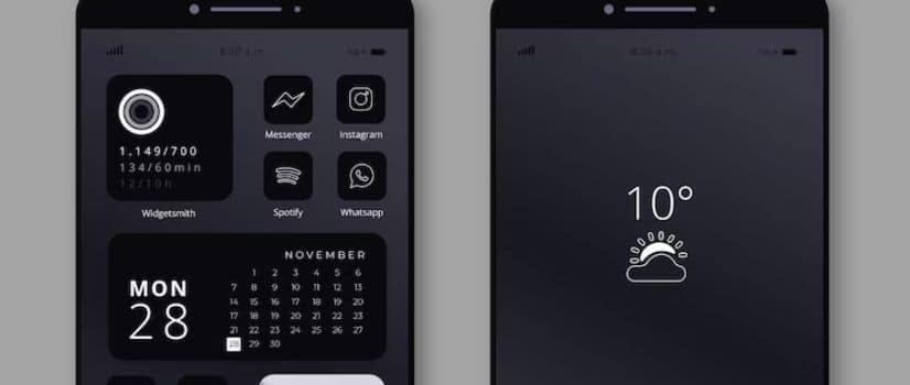
Dark mode refers to an alternative color scheme that uses light-colored text, icons, and other visual elements on a dark background. This visually striking design choice not only offers a fresh aesthetic but also delivers concrete benefits in terms of user experience. Embracing dark mode can minimize eye strain in low-light environments, extend device battery life, and cater to individual user preferences, ultimately fostering greater engagement and satisfaction.
However, implementing dark mode in a way that truly enhances user experience demands a holistic understanding of user needs, as well as a grasp of design principles and best practices. In the following sections, we will explore the advantages of introducing dark mode to your website, discuss crucial design considerations, and offer guidance on creating seamless and accessible dark mode experiences.
The User Experience Advantages of Dark Mode
As dark mode continues to trend in the digital design world, it’s essential to consider the user experience benefits it brings to the table. Here are four advantages of incorporating dark mode into your website:
- Reduced Eye Strain: Dark mode can minimize eye strain, particularly in low-light conditions, by reducing the amount of bright light emitted by screens and enhancing text readability.
- Increased Battery Life: Many devices can extend their battery life when using dark mode, as it consumes less power than the traditional light mode, particularly on OLED screens.
- Enhanced Accessibility: Dark mode provides an alternative visual experience catering to individual user preferences, allowing them to choose their preferred color scheme, and increasing accessibility for those with specific visual requirements.
- Improved User Engagement: Offering users the flexibility to switch between light and dark modes demonstrates a commitment to user comfort and personalization, ultimately boosting user engagement and satisfaction.
Design Considerations for Implementing Dark Mode
Designing a visually appealing and functional dark mode interface requires attention to detail and a deep understanding of essential design principles. Here are four key design considerations to keep in mind when implementing dark mode on your website:
- Color Palette: Choose complementary colors for dark mode that provide appropriate contrast between text, icons, and background. This ensures optimal readability and aesthetics while maintaining consistency with your brand identity.
- Contrast Ratio: Maintain a proper contrast ratio between text and background colors, adhering to accessibility guidelines to accommodate users with visual impairments or specific color vision requirements.
- Imagery: Adjust image brightness, contrast, and saturation levels to harmonize with the dark background, preventing visual disturbances and maintaining image quality and clarity.
- Design Consistency: Ensure that the dark mode interface remains visually consistent with other aspects of your website, incorporating similar typography, iconography, and layout elements to provide a cohesive user experience.
Adopting Best Practices for Dark Mode Design
To create a seamless and user-friendly dark mode experience, adhere to the following best practices in your design process:
- Offer User Control: Provide users with a straightforward means of toggling between light and dark modes, empowering them to choose their preferred visual experience and demonstrating your commitment to personalization and accessibility.
- Test Thoroughly: Conduct rigorous testing and optimization of your dark mode design across various devices, browsers, and screen resolutions, ensuring a seamless user experience and uncovering opportunities for improvement.
- Balance Aesthetics and Functionality: As you design your dark mode interface, keep functionality in mind, and strike a balance between visual appeal and usability, taking advantage of the benefits dark mode offers while avoiding potential drawbacks.
- Account for Typography: When transitioning to dark mode, reevaluate your website’s typographic choices to ensure that text remains readable and visually harmonious with the darker background, maintaining an optimal user experience.
Successful Real-World Dark Mode Implementations
Let’s delve into real-world examples showcasing effective application of dark mode design principles, inspiring your own dark mode endeavors:
- News Websites: Many online publications, such as The New York Times and The Guardian, have integrated dark mode to improve readability, reduce eye strain, and cater to individual user preferences.
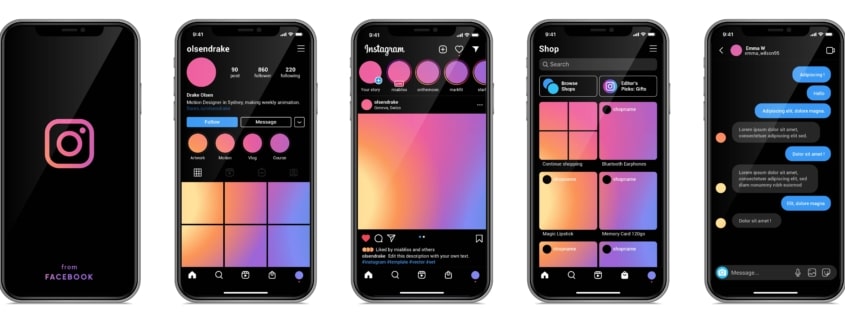
- Social Media Platforms: Social media giants like Twitter and Instagram have adopted dark mode, offering users an alternative visual experience that enhances battery life on compatible devices and reduces eye strain during extended browsing sessions.
- E-Commerce Platforms: E-commerce sites, such as Shopify, provide dark mode functionality to improve user experience, offering an aesthetically pleasing and accessible browsing and shopping experience across various devices and screen types.
Embrace the Power of Dark Mode for an Exceptional User Experience
Incorporating dark mode into your website design can significantly enhance user experience, engagement, and satisfaction. By understanding the advantages of dark mode, adopting essential design considerations, and employing best practices, you can create a versatile and user-centric website that caters to individual user needs and preferences in 2024.
As an award-winning web design agency in Las Vegas, Once Interactive leverages our expertise to create stunning, user-friendly websites tailored to our clients’ unique needs. Reach out to us today and discover how we can help you harness the power of dark mode to create a truly exceptional online experience for your users.


