Mastering Website Typography in 2024: Boost User Engagement and Conversion Rates
Introduction:
Typography plays a vital role in shaping the overall user experience of a website. It goes beyond the mere aesthetics of a site, heavily influencing user engagement, readability, and conversion rates. As digital experiences continue to evolve, mastering website typography in 2024 is more crucial than ever for creating a visually captivating and effective online presence. In this article, we’ll examine the role of typography in web design, delve into best practices for tailoring content to improve user experience, and offer valuable tips for businesses seeking to optimize their website typography to drive engagement and conversions.
At its core, typography is the art and technique of arranging type to make written language legible, readable, and visually appealing. This crucial aspect of web design combines the selection of typefaces, point sizes, line lengths, line-spacing, and letter-spacing to create a cohesive, engaging, and easy-to-navigate interface. Typography not only has a significant impact on how users perceive and consume content but also contributes to the overall ambiance and emotional impact of a site.
User experience is directly linked to the design choices made for typography. Website visitors are more likely to engage with content that is easy to read and visually appealing. Ensuring the readability and legibility of your content on various devices and screen sizes, as well as catering to audience preferences, can make a noticeable difference in user engagement, retention, and conversion rate optimization.
Typeface Selection: Finding the Perfect Fit for Your Website
Choosing the right typeface is critical to conveying your brand personality and fostering a positive user experience. Keep in mind the following considerations when selecting a typeface:
- Brand Alignment: Your chosen typeface should reflect your brand’s core values and aesthetic, evoking the desired emotions while remaining legible and visually appealing on various devices.
- Readability: Opt for typefaces that are easily readable, avoiding overly decorative fonts that may hinder content consumption or strain users’ eyes.
- Compatibility: Ensure that your chosen typeface is supported and displays seamlessly across different devices and browsers.
Utilizing Font Sizing, Spacing, and Text Hierarchy to Enhance Readability
Optimizing your website’s typography for readability involves more than just choosing the perfect typeface. Consider the following aspects to enhance users’ engagement with your content:
- Font Sizing: Employ responsive font sizing with scalable units (e.g., “em,” “rem,” or “%” units) that adapt to different screen sizes, ensuring legibility on all devices.
- Line Spacing: Optimize line-spacing (or leading) to balance readability with visual appeal. Aim for 1.4 to 1.6 times the font size, adjusting as needed for the best user experience.
- Text Hierarchy: Create a clear hierarchy within your content, using various font sizes, colors, and styles to distinguish headings, subheadings, and body text. This approach facilitates easier navigation and helps users quickly identify critical information.
Responsive Typography: Adapting to a Multiscreen World
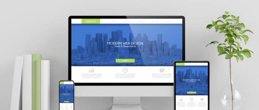
With users accessing websites across various devices, responsive typography is crucial for ensuring a consistent and legible reading experience. Implement the following practices to achieve truly flexible typography:
- Fluid Typography: Utilize CSS3 viewport units (e.g., “vw,” “vh”) to create fluid typography that scales seamlessly with the viewport size, ensuring legibility on any device.
- Media Queries: Apply media queries to adjust your typography based on the device’s screen size, ensuring that every font element is optimized for optimal readability on each specific screen.
- Modular Scale: Produce a harmonious typographic system by incorporating a modular scale, creating consistent, aesthetically pleasing proportions between font sizes.
Prioritizing Accessibility in Website Typography
Designing with accessibility in mind benefits not only users with disabilities but also your website’s overall user experience. Implement these guidelines to create inclusive typography:
- Color Contrast: Maintain a high color contrast ratio between your text and background colors to ensure legibility for all users, including those with vision impairments.
- Scalable Text: Enable users to resize text easily without losing content or functionality, catering to various reading preferences and abilities.
- Clear Visual Hierarchy: Use formatting, such as headings, lists, and whitespace, to structure your content logically, making it straightforward for users to navigate and consume.
Mastering Website Typography to Drive User Engagement and Conversions
Mastering the art of website typography can profoundly impact user engagement, brand perception, and conversion rates. By focusing on typeface selection, font sizing, text hierarchy, responsive typography, and accessibility, you can create an enticing and easy-to-navigate website that resonates with your target audience and drives measurable results.
Our expert team of web designers and digital marketers at Once Interactive is committed to helping businesses like yours harness the power of typography to create visually stunning and effective online experiences. Contact us today and let us transform your website’s typography into a powerful tool that drives user engagement and conversions.


