Crafting Mobile Magic | Essential Web Design Tips for Mobile

Mobile Web Design Tips

Your website is the face of your business. Every aspect of it should communicate your corporate mission and vision. Mobile websites are a unique opportunity to engage your visitors. For that reason, I’ve written the following tips to help you create an appealing mobile site.

Read on!

Future Proof
The technology of tomorrow will be vastly different from today. The new device is just around the corner. When you consider your mobile website, invest in a design that can work across multiple devices. Utilize a single site instead of building separate mobile sites. We call this responsive web design and all the websites we build comes with this type of functionality.

Content
The information on your mobile site should reflect that of the desktop version. Otherwise, you may alienate visitors with a bare-bones version. There’s a reason we sometimes opt to use the desktop version instead of the mobile one for certain sites. Try to spare that experience for your visitors.

Target Your Audience
The worst sin you can commit is to assume what device your audience is using. Narrow down what your audience uses. Figure out how they use it; are they on the go or at home? Finally, optimize the experience for your mobile visitors. This is your opportunity to create a unique experience for them.

Analytics
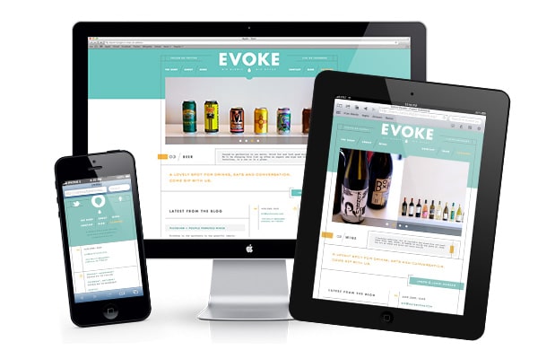
mobile-web-design This is a no brainer. Utilize analytics to increase knowledge about your visitors. This will tell you everything you need to know about what devices they use to browse, their operating systems and even which version of that operating system is being used!

User Compatibility
Remember that every operating system is different. Make sure you adhere to the guidelines of each interface to guarantee a smooth experience for all of your mobile website visitors. Also, there are multiple versions of each OS out there; your site should be responsive to all of them. It’s never good to alienate users who have yet to update.

Navigation
The lack of screen real estate on mobile devices is an interesting challenge. Your mobile site needs to provide quick access to information; therefore, I suggest you limit the number of layers of navigation. The content of your site needs to be delivered quickly and cleanly. Always try to design from the point of view of the user.

Test
Don’t forget to test the function and stability of your mobile site. With each prototype conduct tests to ensure that everything works and to identify potential problems. Review the performance across the different devices and operating systems.

Conclusion
I have no doubt that mobile website design is an art form completely different than that of desktop design. For that reason, remember that some elements are going to be better suited to mobile than they are to a desktop. Don’t try to replicate every feature of one on the other. They are different for a reason. Use that difference to create great experiences for both platforms.

I look forward to your thoughts on this. You can find out more about the services we offer here.

blogs

Mobile Web Design Tips

Your website is the face of your business. Every aspect of it should communicate your corporate mission and vision. Mobile websites are a unique opportunity to engage your visitors. For that reason, I’ve written the following tips to help you create an appealing mobile site.

Read on!

Future Proof
The technology of tomorrow will be vastly different from today. The new device is just around the corner. When you consider your mobile website, invest in a design that can work across multiple devices. Utilize a single site instead of building separate mobile sites. We call this responsive web design and all the websites we build comes with this type of functionality.

Content
The information on your mobile site should reflect that of the desktop version. Otherwise, you may alienate visitors with a bare-bones version. There’s a reason we sometimes opt to use the desktop version instead of the mobile one for certain sites. Try to spare that experience for your visitors.

Target Your Audience
The worst sin you can commit is to assume what device your audience is using. Narrow down what your audience uses. Figure out how they use it; are they on the go or at home? Finally, optimize the experience for your mobile visitors. This is your opportunity to create a unique experience for them.

Analytics
mobile-web-design This is a no brainer. Utilize analytics to increase knowledge about your visitors. This will tell you everything you need to know about what devices they use to browse, their operating systems and even which version of that operating system is being used!

User Compatibility
Remember that every operating system is different. Make sure you adhere to the guidelines of each interface to guarantee a smooth experience for all of your mobile website visitors. Also, there are multiple versions of each OS out there; your site should be responsive to all of them. It’s never good to alienate users who have yet to update.

Navigation
The lack of screen real estate on mobile devices is an interesting challenge. Your mobile site needs to provide quick access to information; therefore, I suggest you limit the number of layers of navigation. The content of your site needs to be delivered quickly and cleanly. Always try to design from the point of view of the user.

Test
Don’t forget to test the function and stability of your mobile site. With each prototype conduct tests to ensure that everything works and to identify potential problems. Review the performance across the different devices and operating systems.

Conclusion
I have no doubt that mobile website design is an art form completely different than that of desktop design. For that reason, remember that some elements are going to be better suited to mobile than they are to a desktop. Don’t try to replicate every feature of one on the other. They are different for a reason. Use that difference to create great experiences for both platforms.

I look forward to your thoughts on this. You can find out more about the services we offer here.

About the Author
Bjorn Wallman
As the CEO of Once Interactive, a highly regarded digital marketing agency, Bjorn possesses a deep understanding of the ever-evolving landscape of SEO. He has successfully guided numerous companies towards achieving higher search engine rankings, increased organic traffic, and improved online visibility.

categories