
Responsive Design: Ensuring Your Website Looks Great on Any Device
Your website looks perfect on your desktop. Clean layout, readable text, clear calls to action. Then someone opens it on their phone, and everything breaks.
Images don’t scale. Navigation disappears. Text becomes unreadable. Buttons overlap. That visitor leaves in seconds, and you never hear from them again.
This happens thousands of times daily for businesses that haven’t prioritized responsive web design. The numbers are clear: over 60% of web traffic now comes from mobile devices. Google’s mobile-first indexing means your mobile experience directly affects your search rankings.
If your site doesn’t adapt seamlessly across devices, you’re not just losing visitors. You’re losing business.
Here’s what actually works, where most businesses go wrong, and how to build a digital presence that performs across every screen size.
Understanding Responsive Design
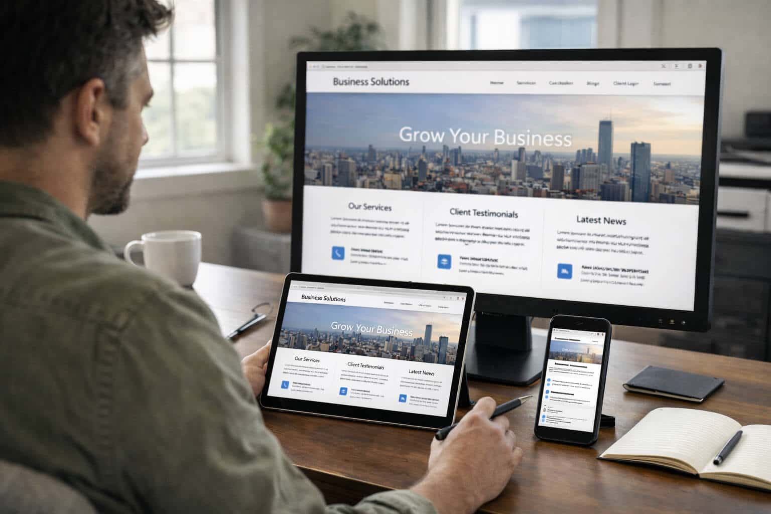
Responsive web design means your website automatically adjusts based on whatever device someone’s using. Desktop, tablet, smartphone. Instead of building separate versions for different devices, you create one flexible site that reshapes itself intelligently.
Three core principles make this work:
Fluid grids replace fixed-width layouts. Rather than locking elements to rigid pixel dimensions, you use percentages. A sidebar set to 25% width stays proportional whether someone views it on a 27-inch monitor or a 6-inch phone.
Flexible images scale within their containers instead of breaking layouts. An image set to max-width: 100% will resize proportionally, never exceeding its boundaries.
CSS media queries detect screen characteristics (width, height, orientation) and apply different styles accordingly. Same HTML. Different visual treatment based on who’s viewing and how.
This differs fundamentally from fixed layouts, where elements maintain the same dimensions regardless of screen size. Fixed designs either force mobile users to pinch and zoom constantly, or they break entirely, with content spilling everywhere.
Responsive design works by asking “How big is this screen?” and then serving the most appropriate layout for that context.
Why Responsive Design Matters More Than Ever
Mobile browsing crossed the tipping point years ago. Your audience isn’t choosing between desktop and mobile anymore. They’re using whatever device is convenient in that moment.
Google recognized this shift and adjusted its entire indexing approach. Mobile-first indexing means Google predominantly uses the mobile version of your content for ranking. If your mobile experience is poor, your search rankings suffer, regardless of how polished your desktop site looks.
This isn’t coming. It’s already here.
The user experience benefits extend beyond just fitting content on smaller screens. Responsive sites typically show lower bounce rates because visitors stay when content is readable and navigation is intuitive. They show higher engagement because when someone can easily browse products, read articles, or fill out forms without fighting the interface, they’re more likely to complete their intended action.
From a business perspective, responsive design makes economic sense. You maintain one website instead of separate mobile and desktop versions. Updates happen once and deploy everywhere. Analytics become clearer because you’re tracking one unified experience.
Most importantly, responsive sites convert better. When the path from interest to action is frictionless, more visitors complete it. A well-designed, mobile-responsive website removes barriers between your business and your customers.

Responsive Design vs. Adaptive Design
The terms sound similar, but they solve the same problem differently.
Responsive Design
Responsive sites use fluid grids that continuously adjust. As the browser width changes, elements resize smoothly in real-time.
Pros: Works across any screen size, even future devices. Simpler to maintain with one flexible codebase.
Cons: More complex initial build. Requires careful planning for all possible sizes.
Adaptive Design
Adaptive sites detect the device type and serve one of several predefined layouts.
Pros: More control over the exact experience at each breakpoint.
Cons: Requires maintaining multiple layouts. Doesn’t handle unexpected screen sizes gracefully.
Which Approach Works Best?
For most modern websites, responsive design wins. The device landscape is too fragmented to predict every possible screen size, and responsive design handles that uncertainty naturally.

Best Practices for Responsive Web Design
To make a site that really responds, you need more than just flexible images and fluid grids. This is what makes some sites technically responsive but not really useful.
Design for mobile first. Start by designing for the smallest screen, and then make it better for bigger screens. This makes you think more about what is most important and how to organize it.
Make it clear what the order of importance is for your content. Put the most important parts of your content at the top. Users should never have to scroll past things that aren’t important to get to the main calls to action.
Use fonts that can be scaled. Relative units (rem and em) help text grow and shrink as needed. For body text on mobile, try to get at least 16px.
Optimize images and other media without mercy. Use srcset and other responsive image techniques to show images that are the right size for the screen. Compress a lot without losing quality that can be seen.
Make things that work with touch, not just clicks. Touch targets need to be big enough (at least 44×44 pixels) and spaced out enough so that people don’t accidentally tap them. Hover-only interactions can’t hide important information.
Try it out on real devices and browsers. Browser developer tools are useful for quick checks, but they don’t show performance issues or rendering problems that only happen on real hardware.

Tools and Technologies for Responsive Design
CSS frameworks like Bootstrap and Tailwind CSS come with ready-made responsive grid systems that make development a lot faster.
Responsive design testing tools like BrowserStack and LambdaTest let you test your site on hundreds of different device and browser combinations.
Built-in responsive design modes in browser developer tools make it easy to make changes quickly during development.
WordPress and other content management systems come with responsive themes right out of the box. Responsive design should be one of the most important things to look for when choosing a website development platforms.
Tools for optimizing performance, like Google PageSpeed Insights, find specific issues that affect the mobile experience.
Real-World Examples of Effective Responsive Design
E-commerce websites. On desktop, product grids can have more than one column, but on mobile, they can only have one. Mobile checkout is easier with fewer form fields, bigger buttons, and payment options that work on all devices. Shopify-powered stores show native mobile experiences.
Websites for businesses and SaaS. Responsive design for businesses that works well puts calls to action first on all devices. Complicated feature tables can turn into accordions that can be opened up or cards that can be swiped. Using multi-step methods, lead forms are easier to use on mobile.
Blogs and content sites. Responsive blogs change the length of lines to make them easier to read. Images still have an effect without slowing down mobile performance. On mobile, navigation is less important than reading.
Common Challenges in Responsive Design
Mobile devices have a lot of problems with performance. Every kilobyte counts because connections are slower and processors are less powerful. To fix this, you should compress images, minify code, use lazy loading, and get rid of scripts that aren’t needed.
Not all complex layouts can be turned into simpler mobile presentations. Mobile and desktop don’t always work the same way. A detailed dashboard might have simplified mobile views that focus on the most important metrics.
When images load too large or show too small, they have problems with scaling. When managing content, you need to be disciplined when using responsive image techniques.
It takes a lot of planning to keep things consistent without making experiences that are the least common denominator. The mobile version shouldn’t feel like an afterthought that was thrown together quickly.
Future Trends in Responsive Design
Mobile-first and mobile-only experiences acknowledge primary mobile usage, with desktop serving as an alternative view.
Foldable and wearable devices add new levels of complexity that call for responsive techniques for very different uses.
AI-assisted layout optimization will make responsive experiences more personal by taking into account how each person acts.
Accessibility-driven responsiveness makes accessibility a part of the system by default, not as a separate issue.
Voice and gesture interactions will make responsive design work in more ways than just how things look.
Key Takeaways for Businesses and Designers
Responsive design is what people expect. New devices will come out, and websites that follow responsive design principles will be able to work with them without having to be completely rebuilt.
Things you can do to make your response time better:
Use Google’s Mobile-Friendly Test to check out your current mobile experience. Write down what makes you angry or breaks.
Use picture and srcset elements to make images better. This usually makes the biggest difference in mobile performance.
Check the sizes of touch targets on interactive parts. This has a direct impact on conversions.
Try out the forms on your phone. If they’re hard to use on mobile, you’re losing business because they’re direct conversion points.
If your site wasn’t built to be responsive from the start, you might want to think about getting a professional review for strategic implementation.
Conclusion
Responsive design represents more than technical implementation. It’s a commitment to meeting your audience on their terms. Every device, every screen size, every context should deliver an experience that works.
The websites showing up in search results six months from now are the ones providing genuinely responsive experiences today. Google rewards sites that serve users well across devices. Users reward sites that don’t waste their time.
Your website represents your business 24/7 across every device category. Whether someone finds you on a phone during lunch, a tablet while researching from home, or a desktop at their office, that experience shapes their perception of your professionalism and credibility.
Start with an honest assessment. How does your site actually perform on mobile? The answers might be uncomfortable, but they’re the starting point for improvement.
Frequently Asked Questions
What is responsive web design?
Responsive web design makes your website’s layout, images, and features change automatically depending on the device and screen size being used. This makes it one flexible site that works on all devices.
Why is responsive design important for SEO?
Google uses mobile-first indexing, which means that a bad experience on mobile will hurt your search rankings, no matter how good your desktop experience is.
How does responsive design improve user experience?
It gets rid of friction by getting rid of the need to pinch, zoom, or scroll sideways. This makes navigation easy and content readable on all devices.
What is the difference between responsive and adaptive design?
Responsive uses fluid grids that change all the time, while adaptive uses set layouts based on what kind of device it is.
Is responsive design necessary for all websites?
Yes, responsive design is a must because more people are using mobile devices than desktop computers and Google is now indexing mobile sites first.
How can I test if my website is responsive?
Use Google’s Mobile-Friendly Test, the responsive modes in your browser’s developer tools, and, most importantly, use your site on your phone and tablet.
What tools are best for building responsive websites?
CSS frameworks like Bootstrap and Tailwind, modern content management systems (CMS) like WordPress with responsive themes, and testing tools like Google PageSpeed Insights.
References
- Nielsen Norman Group. (n.d.). Responsive Web Design (RWD) and User Experience. https://www.nngroup.com/articles/responsive-web-design-definition/
- Google Developers. (n.d.). Responsive Web Design Basics. https://developers.google.com/web/fundamentals/design-and-ux/responsive
- Smashing Magazine. (2011). Responsive Web Design: What It Is and How to Use It. https://www.smashingmagazine.com/2011/01/guidelines-for-responsive-web-design/
- MDN Web Docs. (n.d.). Responsive design. https://developer.mozilla.org/en-US/docs/Learn/CSS/CSS_layout/Responsive_Design
- W3C. (n.d.). Mobile Web Best Practices. https://www.w3.org/TR/mobile-bp/


