The Art of Responsive Web Design | A User-Centric Approach

Responsive Web Design

In her presentation at An Event Apart in Washington DC 2012 Sarah Parmenter talked about the changes responsive Web design requires of Web designers. Here’s my notes from her talk on Responsive Design Workflow:

Responsive design is new for many organizations. Our workflows are responsible for most of the challenges teams face with responsive design. 56% of people surveyed had to change their workflow considerably to accommodate responsive web design.

Mobile is growing rapidly and forcing many designers to adapt. Over half of Facebook’s traffic is on mobile. Over 40% of new tweets are created on mobile. 10% of global Web traffic is now on mobile.

64% of people are offering responsive Web design as an integrated service for their clients.

Responsive design is never really quite finished. It’s a constant evolving process. We can’t simply make mock-ups in Photoshop and assume we are done. Web design is no longer one size fits all. People use different devices in different situations.

You have to think ahead and plan for variations in advance.

Most of us store our workflows in our heads. We need to share what we are doing so others can learn and enhance them.

Standard workflow: stricture, content, typography, mood boards, UI pattern library, asset management, native considerations.

Adobe’s InDesign allows you to make more fluid layouts than Photoshop. As a result, it may be a better design tool for responsive sites.

Native application design can be easier than Web design because there is a fixed canvas. But porting these fixed designs between platforms can be problematic. Different platforms require different solutions.

Responsive design forces you to think in terms of puzzle pieces that adapt to different devices instead of in fixed canvas designs.

Structure & Content Structure & Content Start with understanding what the most important information in your product is, you can learn this through direct observations, click tracking, server logs or more.

You can design with complete content, but not without an understanding of the content structure.

65% of Web developers surveyed design to common breakpoints (320px, 768px, etc.) but we need to be more device agnostic.

Gridpak is a tool for generating responsive grids.

Grid Set is a tool for creating nonstandard grid systems that can apply design principles like golden ratio to your designs.

Aptus is an application for viewing designs in different breakpoints and creating screen shots of those different designs quickly.

We need to stop using lorem ipsum text in our designs. It’s ok if we don’t have complete content but we need complete content structure when we start designing.

Even if you get content in advance, it may need to be re-written or adjusted for the Web. As a quick fix, consider using a traffic light system: red (remove), yellow (for large screens only?), green (all devices).

Voice & tone is an important consideration for your content. Mail Chimp’s public guidelines are a great example. Mail Chimp changes their tone based on the situation: error, failure, etc. Context matters.

Typography Typography TypeCast allows you set fonts and styles in the Web browser to see what your type will look like in the browser.
The browser is a better way to see what type will actually look like than Photoshop.

WhatFont is a tool (bookmarklet) for finding what fonts a Web site is using.

Mood Boards
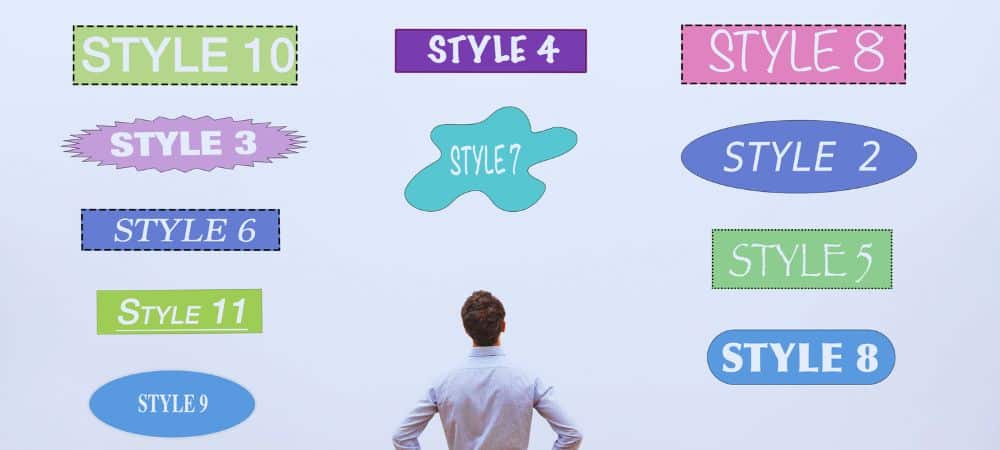
Style Tiles are a useful tool for presenting designs independent of screen sizes. They focus more on mood and brand attributes.

Static visual mock-ups are the currency of the Web but this needs to change. We can’t keep creating Photoshop images of the design variations we need to manage.

Pinterest is a great place to look for style inspirations for mood boards.

Pattern Libraries
We learn by repetition. A lot of designers have a hard time articulating why a design solution is right. This is likely because we base decisions on our experiences that allows us to detect patterns.

Publishing a set of interface elements as a pattern library can help designers and developers collaborate on consistent product experience.

A typical UI pattern library contains: Multiple size buttons and hover states, Contextual error, success and informational messages, Lists, Paragraphs with all H-Styles, Headers with imagery, Side navigation with advertisements, Blog post layout, Cross device navigation implementations, Color Swatches, Table layout, Forms, Tone of voice examples.

Color swatches can be created with Adobe Kuler. Just pull in a photo and out pops a color palette.

Be mindful different cultures can have different associations with colors.

Asset Management
Creating multiple assets for different screen resolutions can be challenging. A scratch file of the UI elements in an interface can isolate all the assets you need to give developers into a single file.

Slicy is a Photoshop supporting application that allows you to name layers or groups with asset names (png, gif, etc) and export all the required assets for a project at once. It’s great with scratch files.

Slicy can automatically export assets when your Photoshop file changes. This can be a big time savings for designers.

If you use shape layers in Photoshop, you can simply scale up 200% to create 2x images.

This works well for most assets except those with patterns.

You can use Automator on OSX to add “2x” to file names.

Native Considerations Native Considerations 44x44px is Apple’s guidelines for minimum touch target sizes. To make designs work with touch interfaces.
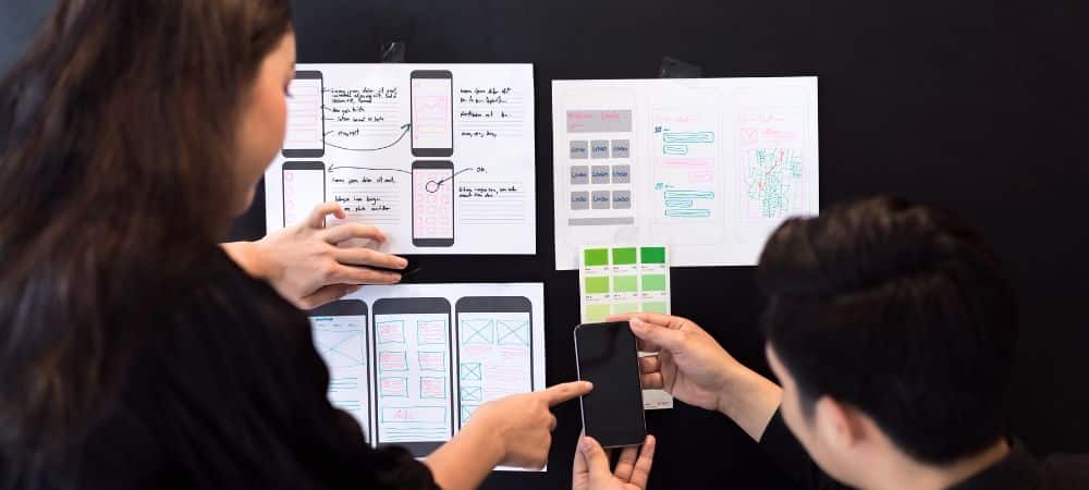
A transparent layer of touch target sizes can be overlaid on a comp to make sure all the touch targets are sized appropriately.

For native applications, you need to crop UI elements to be stretchable, which maybe be different than the way you create assets for the Web.

Different native platforms have distinct conventions. You can’t simply port over one design to all native mobile platforms. Interactions and expectations differ.

This is Web design not religion. We are in one of the most fun industries in the World. We need to stay humble and work hard.

blogs

Responsive Web Design

In her presentation at An Event Apart in Washington DC 2012 Sarah Parmenter talked about the changes responsive Web design requires of Web designers. Here’s my notes from her talk on Responsive Design Workflow:

Responsive design is new for many organizations. Our workflows are responsible for most of the challenges teams face with responsive design. 56% of people surveyed had to change their workflow considerably to accommodate responsive web design.

Mobile is growing rapidly and forcing many designers to adapt. Over half of Facebook’s traffic is on mobile. Over 40% of new tweets are created on mobile. 10% of global Web traffic is now on mobile.

64% of people are offering responsive Web design as an integrated service for their clients.

Responsive design is never really quite finished. It’s a constant evolving process. We can’t simply make mock-ups in Photoshop and assume we are done. Web design is no longer one size fits all. People use different devices in different situations.

You have to think ahead and plan for variations in advance.

Most of us store our workflows in our heads. We need to share what we are doing so others can learn and enhance them.

Standard workflow: stricture, content, typography, mood boards, UI pattern library, asset management, native considerations.

Adobe’s InDesign allows you to make more fluid layouts than Photoshop. As a result, it may be a better design tool for responsive sites.

Native application design can be easier than Web design because there is a fixed canvas. But porting these fixed designs between platforms can be problematic. Different platforms require different solutions.

Responsive design forces you to think in terms of puzzle pieces that adapt to different devices instead of in fixed canvas designs.

Structure & Content Structure & Content Start with understanding what the most important information in your product is, you can learn this through direct observations, click tracking, server logs or more.

You can design with complete content, but not without an understanding of the content structure.

65% of Web developers surveyed design to common breakpoints (320px, 768px, etc.) but we need to be more device agnostic.

Gridpak is a tool for generating responsive grids.

Grid Set is a tool for creating nonstandard grid systems that can apply design principles like golden ratio to your designs.

Aptus is an application for viewing designs in different breakpoints and creating screen shots of those different designs quickly.

We need to stop using lorem ipsum text in our designs. It’s ok if we don’t have complete content but we need complete content structure when we start designing.

Even if you get content in advance, it may need to be re-written or adjusted for the Web. As a quick fix, consider using a traffic light system: red (remove), yellow (for large screens only?), green (all devices).

Voice & tone is an important consideration for your content. Mail Chimp’s public guidelines are a great example. Mail Chimp changes their tone based on the situation: error, failure, etc. Context matters.

Typography Typography TypeCast allows you set fonts and styles in the Web browser to see what your type will look like in the browser.

The browser is a better way to see what type will actually look like than Photoshop.

WhatFont is a tool (bookmarklet) for finding what fonts a Web site is using.

Mood Boards
Style Tiles are a useful tool for presenting designs independent of screen sizes. They focus more on mood and brand attributes.

Static visual mock-ups are the currency of the Web but this needs to change. We can’t keep creating Photoshop images of the design variations we need to manage.

Pinterest is a great place to look for style inspirations for mood boards.

Pattern Libraries
We learn by repetition. A lot of designers have a hard time articulating why a design solution is right. This is likely because we base decisions on our experiences that allows us to detect patterns.

Publishing a set of interface elements as a pattern library can help designers and developers collaborate on consistent product experience.

A typical UI pattern library contains: Multiple size buttons and hover states, Contextual error, success and informational messages, Lists, Paragraphs with all H-Styles, Headers with imagery, Side navigation with advertisements, Blog post layout, Cross device navigation implementations, Color Swatches, Table layout, Forms, Tone of voice examples.

Color swatches can be created with Adobe Kuler. Just pull in a photo and out pops a color palette.

Be mindful different cultures can have different associations with colors.

Asset Management
Creating multiple assets for different screen resolutions can be challenging. A scratch file of the UI elements in an interface can isolate all the assets you need to give developers into a single file.

Slicy is a Photoshop supporting application that allows you to name layers or groups with asset names (png, gif, etc) and export all the required assets for a project at once. It’s great with scratch files.

Slicy can automatically export assets when your Photoshop file changes. This can be a big time savings for designers.

If you use shape layers in Photoshop, you can simply scale up 200% to create 2x images.

This works well for most assets except those with patterns.

You can use Automator on OSX to add “2x” to file names.

Native Considerations Native Considerations 44x44px is Apple’s guidelines for minimum touch target sizes. To make designs work with touch interfaces.

A transparent layer of touch target sizes can be overlaid on a comp to make sure all the touch targets are sized appropriately.

For native applications, you need to crop UI elements to be stretchable, which maybe be different than the way you create assets for the Web.

Different native platforms have distinct conventions. You can’t simply port over one design to all native mobile platforms. Interactions and expectations differ.

This is Web design not religion. We are in one of the most fun industries in the World. We need to stay humble and work hard.

About the Author
Bjorn Wallman
As the CEO of Once Interactive, a highly regarded digital marketing agency, Bjorn possesses a deep understanding of the ever-evolving landscape of SEO. He has successfully guided numerous companies towards achieving higher search engine rankings, increased organic traffic, and improved online visibility.

categories