
6 Top Web Design Tricks to Boost Conversions
In the quest for higher conversion rates, it’s important to recognize that while compelling copy is undoubtedly crucial, it’s not the sole factor at play. Your website’s design exerts a profound influence on conversion rates, and the best-written copy can only do so much if it’s presented with an unattractive, sluggish, or dysfunctional design. This synergy between design and content is where the magic happens. In this article, we’re about to unveil six powerful web design strategies that can help you elevate your conversion rates. So, gear up for some A/B testing and dive into the world of effective web design that can transform your online presence and supercharge your success.
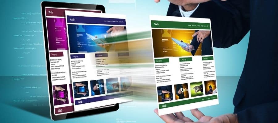
Images

Images are a must, but they must be done smartly. Low-quality images or images that are irrelevant to the offering will damage the impression you give to the visitor. It’s well worth the time to learn some things about digital photography so you can get some great shots, like these shots from Schwan’s, a home food delivery service. Here are some quick rules for image use:
Prioritize High-Quality Photos: The importance of using high-quality images cannot be overstated. Grainy, pixelated, or poorly composed photos can detract from the professionalism and credibility of your website. Avoid using generic or bad stock photos as well, as they can come across as inauthentic and may not resonate with your audience.
Relevance and Context: Images should tell a story that complements your products or services. Show photos of your products in action or people genuinely enjoying them. Placing products in their context and illustrating how they benefit customers can be a powerful way to build trust and make a compelling case for your offerings.
Variety and Interactive Elements: If you’re showcasing products, provide multiple images from different angles. Use clickable thumbnails that allow visitors to browse through these images, giving them a sense of control and a closer look at what you have to offer. Consider implementing a zoom feature for a more detailed examination of your product images, which can be particularly valuable for e-commerce sites.
Image Integration in Navigation: Images aren’t limited to the content area of your website. You can also incorporate them into your site’s navigation. For instance, using images in your menu items can make navigation more visually engaging and intuitive. This can help visitors quickly identify and access the sections of your website that interest them the most.
Engaging Landing Pages: Landing pages serve as a critical point of entry for your audience. Without compelling images, they can come across as dull and uninviting. Conversely, using poor-quality or irrelevant images can negate the very purpose of your landing page, which is to convert visitors into customers or leads. Choose images that captivate and resonate with your target audience.
Decrease Decision Time
People say they love choice, but some clever scientists found out decades ago that the more choices you present someone the longer and harder they have to work to make a decision. This is called Hick’s Law.
If your goal is to facilitate swift conversions, it’s essential to avoid overwhelming your visitors with too many options. By reducing the number of choices they need to make, you enable them to reach decisions more quickly, capitalizing on their initial interest. This is akin to the famous TV show “Let’s Make A Deal,” which limited contestants to a maximum of three choices. By doing so, the show maintained a heightened emotional urge to continue and increased the likelihood of a decision.
However, it’s important to recognize that the effectiveness of limiting options varies with the nature of the decision. In some niches and industries, complex decisions may necessitate a more extensive array of choices to provide customers with a sense of comfort and empowerment. For example, car dealerships often offer a range of models, trims, and customization options, reflecting the intricate nature of the automobile purchase process.
As you strive to enhance your website’s conversion rates, consider experimenting with the following strategies to simplify the decision-making process for your visitors:
1. Reduce the Number of Calls to Action: Limit the number of different actions you present to your visitors. Instead of inundating them with numerous choices, focus on a small, well-defined set of actions that align with your conversion goals. This makes it easier for visitors to decide on the next step.
2. Optimize Product Display: When showcasing products, consider reducing the number of visible items per page. A cluttered product page can overwhelm visitors and impede their decision-making process. Display a curated selection of items that are most likely to resonate with your target audience.
3. Simplify Navigation Menus: Minimize the number of links in each navigation dropdown. A clean and concise menu structure can enhance user experience and guide visitors more effectively to the content or products they’re interested in.
Page Speed
It may seem like an insignificant thing, but if your page takes more than four seconds to load, you’re losing a lot of your potential customers. After 4 seconds, 25% of your visitors have already left your page to go do something else.
Fortunately, it’s really easy to check your site for speed fixes. Google has created a handy tool to help you discover tweaks you can make to improve site speed. Each second you can shave off of your load speed can boost your conversions by 7%, so don’t tolerate a slow page load.
The reasons behind the significance of page speed are manifold. First and foremost, it’s about user experience. Visitors to your website expect quick, seamless interactions. A slow-loading page can be frustrating and drive potential customers away, as they seek more responsive alternatives. Moreover, search engines like Google consider page speed as a crucial ranking factor. So, slow-loading pages can not only deter users but also affect your website’s visibility in search results.
To improve your page speed, you can explore a variety of strategies, such as optimizing images, leveraging browser caching, and minimizing unnecessary code. Each tweak you make can contribute to a faster, more user-friendly experience, ultimately boosting your conversion rates and retaining more of your valuable visitors. In today’s digital landscape, where attention spans are short, and competition is fierce, don’t underestimate the profound impact that a fast-loading website can have on your success.
Mobile Experience
The trends are clear. Mobile users continue to increase, which means your site cannot ignore mobile experiences anymore. Just take a look at this infographic from ImpactBND to see why. A few highlights:
High Abandonment Rates: Mobile users today are incredibly discerning. If a website isn’t adequately optimized for mobile devices, they’re five times more likely to abandon the task they set out to accomplish. This means that even if your desktop site is top-notch, an unsatisfactory mobile experience can drive potential customers away.
Impact on Engagement: A staggering 52% of mobile users have indicated that they are less likely to engage with a company or brand that provides a subpar mobile experience. This should serve as a wake-up call to businesses that want to build and maintain strong customer relationships. Neglecting mobile optimization can lead to missed opportunities and a tarnished reputation.
Conversion Potential: The digital world is increasingly becoming mobile, and this shift is especially evident in search behavior. Approximately 80% of searches conducted on mobile phones result in conversions. This means that having a website that caters to mobile users can significantly boost your chances of turning those searches into leads, sales, or other valuable actions.
Given these compelling statistics, it’s clear that ensuring a seamless mobile experience is no longer a choice but a necessity. In fact, if your primary goal is to maximize conversions, it may be wise to prioritize mobile optimization over desktop considerations. Here’s why:
Mobile devices have become an integral part of our daily lives. People use them not just for browsing but also for shopping, researching, and connecting with brands. Failing to meet their expectations for a smooth, responsive, and user-friendly mobile experience can result in a missed opportunity to capture a significant portion of your target audience.
Navigation

If your customers cannot find the information they want then they will leave. It’s as simple as that. Navigation through your site should be extremely clear. This post from Kissmetrics has some great examples of good and bad navigation that can help you clean up the worst things.
However, sometimes the best navigation is no navigation at all. If you are building PPC landing pages, giving users a chance to navigate to the rest of your site is an invitation for them to bounce away from the conversion. If you’re going for the hard sell, don’t give them any option to leave.
To help you understand the significance of good navigation, you can turn to informative resources like the post from Kissmetrics, which offers insightful examples of both stellar and problematic navigation designs. Learning from these real-world examples can provide you with the inspiration and guidance needed to enhance your website’s navigation, ensuring that it aligns with best practices.
However, it’s crucial to recognize that in certain scenarios, the most effective navigation strategy might be to minimize or even eliminate navigation options. This approach is particularly relevant when you’re crafting Pay-Per-Click (PPC) landing pages, where the primary goal is to drive conversions with a “hard sell” approach. In such cases, providing users with the means to navigate to other areas of your site could inadvertently distract them from the desired conversion action, leading to a bounce.
By removing extraneous navigation elements and focusing visitors’ attention solely on the conversion goal, you can increase the chances of successfully closing a sale, obtaining a lead, or achieving the intended action. This tactic underscores the importance of aligning your navigation strategy with your specific objectives and the context in which it operates.
Calls To Action
Speaking of buttons, let’s talk about calls to action. If the goal is to get the visitor to convert then that process must be made as clear as possible. If visitors have to hunt for the conversion button or opt-in form you will lose them.
Don’t make your readers go through your entire sales pitch before reaching the conversion point at the bottom of the page. Always put one call to action above the fold. Make it easy to find and clear about what the user will get. For instance, if you are offering a free eBook in exchange for an email address, don’t have the button say “sign up now”, have it say “Get my free eBook”. If your sales page is long, then it’s okay to add other calls to action along the way so readers don’t have to scroll back up to the top to convert.
Examine your landing pages in light of these design tricks. Are you following them? If not, give them an A/B test and see if you get an improved conversion rate. We think you’ll get a nice bump from making a few tweaks to your site design.


