Riding the Wave: 6 Dominant Web Design Trends

6 Web Design Trends That Are Taking Over the Internet

The year’s already halfway over and, in that time, we’ve seen many web design trends come and go. Surprisingly, it seems that we are once again starting to embrace basic principles; albeit without superfluous features. Gone are the days of cluttered pages full of information, they are now being replaced by a heightened interest in user interfaces and simple design.

Interested in learning more? Check out our list of the 6 hottest web design trends that are taking over the internet.
web-design-trends 1. Ghost Buttons and Line Icons
Since the release of Apple’s iOS 7, ghost buttons and line iconography (see-through buttons that are outlined by a thin line), have grown in popularity. The use of both of these brilliant web design concepts results in a simpler aesthetic that naturally emphasizes colorful illustrations or photography.

Real World Example:
The popular Google tablet, the Nexus 7, uses ghost buttons to create an unbroken image of the product; this type of design puts the focus on the product, not the text.

2. Material Design
You could say that the material design concept is the next step forward in flat design– a highly popular type of user interface design that takes a minimalist approach. Material Design was developed by Google and is a combination of the tenets of flat design with slight animation and gradients to showcase aspects of the 3D world. It is expected that we will begin to see more of this trend once it becomes better integrated into the mobile and desktop experience.

Real World Example:
There are many examples of the material design concept in Google’s updated operating system, like the address bar that pulls double duty as a progress bar. This concept simplifies the mobile layout and enhances user experience.
villani-health 3. No Header Background Image
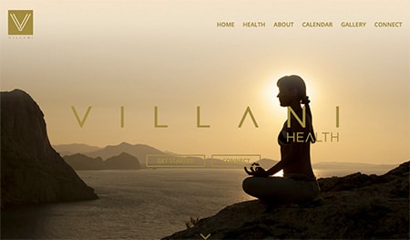
In recent years, brands have begun to place big, customized pictures in their campaign areas; similarly to the images that appear in magazines. Although this trend is still quite popular, we predict that campaign areas will begin to get simpler and contain less imagery. Doing so will remove visual distractions and allow web users to get straight to the content.

Real World Example:
The Moodlerooms website places its focus on bold typography and bright colors; two components that have been essential in building this brand’s personality. They also utilize simple, but fun, line icons that are in keeping the image of their brand. These seemingly innocuous techniques help drive site visitors directly to the content.

4. Microinteractions
When it comes to good web design and user experience, the devil is in the details; web savvy users will notice the presence, or lack thereof, of subtle interactions on a site. Small animations make the content seem more interesting and will help to increase user engagement. Not only are these animations fun but they are also becoming more informative and meaningful.

Real World Example:
LinkedIn creates subtle interactions that are normally found on our mobile devices. For example, when users hover over the content area, a “Skip” button is revealed that gives users more options.
3PEA-video-background 5. Full Screen Video
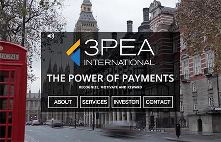
While it’s true that minimalist web design elements are all the rage right now, on the opposite end of the spectrum full screen backgrounds and videos are still holding their own. In fact, a recent MIT study revealed that it takes approximately 13 milliseconds for users to process and retain visual images. In other words, a quick hook is all that it takes to grab the attention of users, something that can easily be accomplished with video.

Real World Example:
A major part of the release campaign for the Apple Watch consists of screen filling looping images combined with minimal typography. HTML5 has made many advancements that now allow web designers to do things that were considered impossible in the recent past.

6. Interactive Infographics
Last year, infographics were very popular and, fast forward to 2015, they are getting even better. This is because when web designers combine data with a web interactivity element, everything becomes more fun. That is, users are more engaged because they no longer have to deal with static images, instead they can peruse the infographic, as if it were a website, to get more information.

Real World Example:
The Future of Car Sharing infographic has a ton of information and its horizontal scrolling design helps keep visitors engaged, this is due to the level of interactivity it provides. Its design also brings to mind a timeline aspect, which makes for a simple user experience.

The Bottom Line
As web design trends continue to evolve and become more sophisticated, designers are coming up with additional ways to put their own spin on these already innovative ideas. Elements from the past will continue to play a role in the design principles of the future. As it stands, only time will tell if these elements will continue to evolve or if web design trends will head into an entirely new direction.
blogs

6 Web Design Trends That Are Taking Over the Internet

The year’s already halfway over and, in that time, we’ve seen many web design trends come and go. Surprisingly, it seems that we are once again starting to embrace basic principles; albeit without superfluous features. Gone are the days of cluttered pages full of information, they are now being replaced by a heightened interest in user interfaces and simple design.

Interested in learning more? Check out our list of the 6 hottest web design trends that are taking over the internet.

web-design-trends 1. Ghost Buttons and Line Icons
Since the release of Apple’s iOS 7, ghost buttons and line iconography (see-through buttons that are outlined by a thin line), have grown in popularity. The use of both of these brilliant web design concepts results in a simpler aesthetic that naturally emphasizes colorful illustrations or photography.

Real World Example:
The popular Google tablet, the Nexus 7, uses ghost buttons to create an unbroken image of the product; this type of design puts the focus on the product, not the text.

2. Material Design
You could say that the material design concept is the next step forward in flat design– a highly popular type of user interface design that takes a minimalist approach. Material Design was developed by Google and is a combination of the tenets of flat design with slight animation and gradients to showcase aspects of the 3D world. It is expected that we will begin to see more of this trend once it becomes better integrated into the mobile and desktop experience.

Real World Example:
There are many examples of the material design concept in Google’s updated operating system, like the address bar that pulls double duty as a progress bar. This concept simplifies the mobile layout and enhances user experience.

villani-health 3. No Header Background Image
In recent years, brands have begun to place big, customized pictures in their campaign areas; similarly to the images that appear in magazines. Although this trend is still quite popular, we predict that campaign areas will begin to get simpler and contain less imagery. Doing so will remove visual distractions and allow web users to get straight to the content.

Real World Example:
The Moodlerooms website places its focus on bold typography and bright colors; two components that have been essential in building this brand’s personality. They also utilize simple, but fun, line icons that are in keeping the image of their brand. These seemingly innocuous techniques help drive site visitors directly to the content.

4. Microinteractions
When it comes to good web design and user experience, the devil is in the details; web savvy users will notice the presence, or lack thereof, of subtle interactions on a site. Small animations make the content seem more interesting and will help to increase user engagement. Not only are these animations fun but they are also becoming more informative and meaningful.

Real World Example:
LinkedIn creates subtle interactions that are normally found on our mobile devices. For example, when users hover over the content area, a “Skip” button is revealed that gives users more options.

3PEA-video-background 5. Full Screen Video
While it’s true that minimalist web design elements are all the rage right now, on the opposite end of the spectrum full screen backgrounds and videos are still holding their own. In fact, a recent MIT study revealed that it takes approximately 13 milliseconds for users to process and retain visual images. In other words, a quick hook is all that it takes to grab the attention of users, something that can easily be accomplished with video.

Real World Example:
A major part of the release campaign for the Apple Watch consists of screen filling looping images combined with minimal typography. HTML5 has made many advancements that now allow web designers to do things that were considered impossible in the recent past.

6. Interactive Infographics
Last year, infographics were very popular and, fast forward to 2015, they are getting even better. This is because when web designers combine data with a web interactivity element, everything becomes more fun. That is, users are more engaged because they no longer have to deal with static images, instead they can peruse the infographic, as if it were a website, to get more information.

Real World Example:
The Future of Car Sharing infographic has a ton of information and its horizontal scrolling design helps keep visitors engaged, this is due to the level of interactivity it provides. Its design also brings to mind a timeline aspect, which makes for a simple user experience.

The Bottom Line
As web design trends continue to evolve and become more sophisticated, designers are coming up with additional ways to put their own spin on these already innovative ideas. Elements from the past will continue to play a role in the design principles of the future. As it stands, only time will tell if these elements will continue to evolve or if web design trends will head into an entirely new direction.

About the Author
Bjorn Wallman
As the CEO of Once Interactive, a highly regarded digital marketing agency, Bjorn possesses a deep understanding of the ever-evolving landscape of SEO. He has successfully guided numerous companies towards achieving higher search engine rankings, increased organic traffic, and improved online visibility.

categories