Top Features For The WordPress 4.1 Twenty Fifteen Theme
In mid-December, WordPress 4.1 was released, and was named ‘Dinah’ in honor of a renowned jazz singer, Dinar Washington. This version comes with various features, most of which portray a back-to-basics theme.
The WordPress 4.1 showcases great features without additional bloats, or features that ought to be added by plugins, and not themes.
Actually, themes are meant to style up the functionality a website and not to add on them. In this sense, this latest WordPress version, the Twenty Fifteen, is definitely a spot on when it comes to functionality.

Now, Let’s have a look at some of the great features associated with WordPress 4.1
(1) Customization
With its premium option, you’ve got limitless options at your disposal. The twenty fifteen version comes with enough customizable options to make you have enough control over the website, and change it as you would like to.
The two most noticeable controls include the capability to customize the background of the sidebar and customizing the content section. This actually offers a surprising amount of variations.
(2) A Beautifully Executed Responsiveness
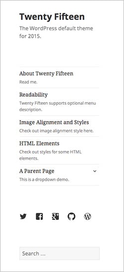
This particular menu is neatly tucked behind a button and remains displayed thus making it easier for a user to browse through the site. This gets the user where he or she needs to be. Here, even the child pages are intuitive and easily accessible.
The images, post-meta and the gallery sections are all great and their readabilities are maintained on every page. This makes reading a page running on a WordPress 4.1 via a mobile platform easier and a genuine pleasure.

This is probably the best thing about the twenty fifteen version – putting more focus on quality of content. However, in the process of concentrating on content, it mainly dwelled on quantity, and less on quality.
But this is more of an upside than a downside. For example, the side bar gives you a greater opportunity to cross promote content. This is ideal for casual writers and bloggers.
If you’ve got an online store, this theme is definitely a no-go option. It is vital to keep it in your mind that these default themes are just for showcase of functionality, and less on catering to all plugins.
(4) Social Icon Menu
The icons might give the newcomers a hard time who would like to add a social icon, but for those who’ve been with WordPress for quite some time now, then this may come naturally.
Also, the social icons on screenshots have been added using regular old menu editor. You just need to add your URLs along with the names, and the themes will automatically convert them into correct icons.
(5) A Static Sidebar
Its sidebar scrolls while the content remains stationary, thus meaning that you get to see an empty strip next to the content. This in turn enables the author to add more thoughts on the sidebars, hence generally shortening pointless long asides.
As a matter of fact, this somehow forces you to think about what’s more important and what isn’t, eventually resulting in a more planned and better streamlined site.
(6) An Easy on the Eye Overall Design
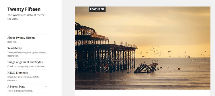
Unlike the twenty fourteen version, the Dinar edition has well placed images that offer splashes of color where needed. Other than that, there is a plenty of room for white space thus making the texts to be easily readable.
This is in contrast to the previous version, which was overly-busy. More to the new breath of fresh air that comes with the Dinar edition, its default lighting color scheme is overwhelmingly awesome!

(7) Image Flexibility
Even though the featured images don’t offer enough options – something unexpected – the flexibility of the images is enough to make your website attractive, with a large diversity of images.
That is, you can choose to go with a high featured image, a no featured image, or just choose a small strip. Basically, depending on the image you’ve used, you can make the website look upbeat and much more fun, or even more polished and stylish.
Extra Geeky Stuff for the Developers
The twenty fifteen WordPress 4.1 wasn’t just meant for the novice users, but also for the geeky developers. For a full list of the changes, you can visit https://codex.wordpress.org/Version_4.1 … But here is a sneak peek;
Title Tags
The developers can now control their own document title without clashing it with WordPress-generated title tags.
Customizer API
The customizer aims at building a complete JavaScript API, and there are lots of improvements for the contextual panels and sections.
Complex Queries
Plugin and theme developers have the capability to make use of an advanced conditional logic, multiple operators and nested clues and include them in their date, Meta and term queries.
Final Thoughts
Generally, the twenty fifteen version is meant for people love writing on a minimal interface. And its overall look is harmonious, meaning that it radiates simplicity and its theme seems like a well thought out idea.
I hope you enjoyed reading about this new amazing FREE theme from the WordPress team.
To get going on your own project please feel free to Contact Me or you can read more about our WordPress Services.


